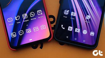
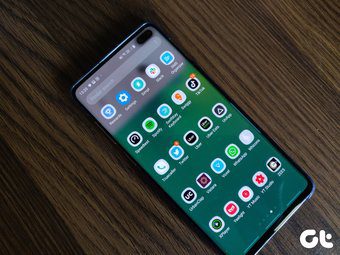
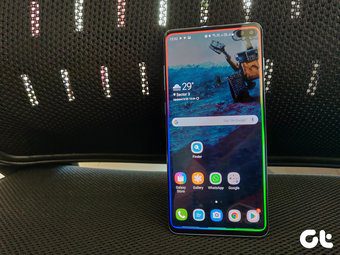
Samsung has recently redesigned One UI with productivity in mind. Along with that, the company is using Galaxy Note line-up with Dex functionality to provide a worthy laptop alternative. After all, it’s all about solving today’s problems of carrying too many devices and getting things done on time with a few. In this post, we are going to compare Microsoft Launcher to Samsung One UI and conclude if it’s worth switching? And what advantages Microsoft launcher brings to the table, especially for Windows users? Let’s jump in. Download Microsoft Launcher
User Interface
Interface design can make or break the decision for you. With One UI, Samsung has taken a giant leap. Gone are the days of blue/yellow theme of TouchWiz. The One UI replaces the bloated experience and the interface now looks minimal, better, and comes with rounded corners that match with a Galaxy phone design. All Samsung apps such as dialer, settings, contacts, calendar, notification toggles, etc. look and feel consistent, which wasn’t true before. Microsoft launcher is using a transparent theme by default. The menus and search bar have rounded corners, and the overall UI is right up there with modern standards.
Customization Options
Samsung has added every possible trick to let you customize a phone the way you like it. You can change home screen layout, icon grids, hide apps, remap Bixby button, change Always on Display, and more. Strangely, the company doesn’t allow you to install a third-party icon pack integration in the One UI. Microsoft, on the other hand, keeps it simple. With Microsoft launcher, you can change dock settings, home screen layout, apply third-party icon pack, change folder shape, play with badge icons, and more. You can also change the default search engine to Bing or Yahoo.
Theme Support
Samsung offers a dedicated theme store to change the look and feel of the One UI. You can apply new wallpaper, new accent colors, icons, and customize the Always on Display on the lock screen. The possibilities are endless here. I’m sure you will stumble upon something you like. Samsung has added dark theme support in the settings. You can schedule it to automatically turn on at night and back to a light theme in the morning. It’s a pure black theme and not a dark grey. So, you are saving some battery juice on AMOLED screens too. With Microsoft Launcher, you can change accent colors, and choose from a dark or transparent theme. I must say, the transparent theme does look amazing.
Extra Features
As you may have guessed, Samsung has implemented a plethora of functions with One UI. There is a blue light filter for night reading, a secure folder for keeping private info safe, screen recorder, One-handed mode, Bixby routines to automate tasks, and more. Since an OEM adds these functions, you can have access to all of them while using MS launcher too. Microsoft launcher offers tight integration between mobile and PC. My Feed menu (more on that later) lets you access Sticky Notes, To-Dos, Outlook calendar, favorite contacts, apps, with ease. The launcher comes with Windows Timeline support which syncs the word documents, browsing history from PC to mobile and vice versa. The third-party launchers will never work as smoothly as an OEM skin with navigation gestures. Especially with upcoming Android Q, the system warns about using a third-party launcher with full-screen gestures. That is a big minus point of any third-party launcher compared to a default one.
Bixby Home vs. My Feed
Microsoft launcher offers My feed menu on the left side of the main homescreen. It consists of three tabs, and the default one shows the recently used apps, contacts, weather information, Sticky Notes, apps widgets, and more. As I mentioned above, Windows Timeline keeps the browsing history and Microsoft apps in sync with Android and PC. So, you can start working on a document from a PC, and access it from a phone with just a swipe. Remember, you will need to use Microsoft Edge to sync the browsing history. The third tab is news integration. It’s similar to Google News but customizable. You can manually toggle on/off interests and customize the list. Now, let’s see what Samsung has in store. On One UI, swipe left, and the Bixby home is ready to serve you. You can see the weather info, favorite contacts, apps, Gallery widgets, and Bixby routines. You can also pin essential actions such as Twitter trends, Gallery widget, and more.
Do You Need to Switch?
Honestly, no. I’m used to navigation gestures on my Galaxy device. Also, the gestures don’t work properly with any other third-party launcher, let alone Microsoft’s launcher. Microsoft’s Your Phone app and the recently announced partnership with Samsung has closed the gap between a Galaxy device and Windows PC. Next up: Both Samsung and OnePlus are battling to win the premium smartphone segment. They offer compelling hardware with the major difference being the software. Read the post below to see how One UI fares against the Oxygen OS. The above article may contain affiliate links which help support Guiding Tech. However, it does not affect our editorial integrity. The content remains unbiased and authentic.


